

The Mark
Various explorations for the mark were considered, transitioning from simple word marks to shapes and eventually landing on a mark that encapsulates the transition of bringing “non-gamers” from an old and/or fractured understanding of gaming culture, represented by the darker colors and pixelation associated with early video game development and the enclosed capsule space, into a brighter, smoother, and more expansive space that breaks out of the previously shaped mold and deconstructs the pixelation.
Color Palette
The color palette selected is intended to be bright and energetic, combining warm and cool colors, while not veering into the realm of too cutesy, childish, faded, or dark. It was important to strike a balance between presenting variation while not including so many colors as to overwhelm the identity and/or turn into a rainbow.
Rarely will the colors be presented in isolation, as the blending and subsequent creation of more dynamic gradients are meant to represent the multitude of games and people that exist—and can co-exist—in the gaming space in a more effective manner than the colors can when separated.
When used in isolation, the dark purple, while present in the selection, should be utilized for contrast and a point of transition while not meaning to overwhelm the palette at any given point.
The aim is to provide some variety without drowning in darkness. Overall, the lighter colors are intended to be used in higher concentrations than the darker ones, but the element of change and transition should still be present when they all come together.


Typography
New Atten’s rounded form exhibits a friendliness that is more of an approachable sans serif, made also with reading body copy in mind. Figtree’s extrabold and italic form provides a nice contrast to New Atten Round in having a sharper and more energetic quality while holding onto its playfulness.
The italicization is meant to pull the viewer along while the form of the New Atten Round grounds the information. With Figtree being a thicker geometric sans serif, the use of both typefaces in combination creates an opportunity to present a feeling of duality in a space characterized by having an edge but also bringing in a softness to compliment it.
The primary mark is made with both an uppercase New Atten Round (Medium) and a lowercase Figtree (Extrabold Italic). All subheads are made up of the latter, while the body copy takes on New Atten Round’s book form.
The video game industry has seen significant growth in recent decades, but despite its mainstream success, diverse genres, and widespread use, stereotypes and limiting beliefs persist about games and their players.
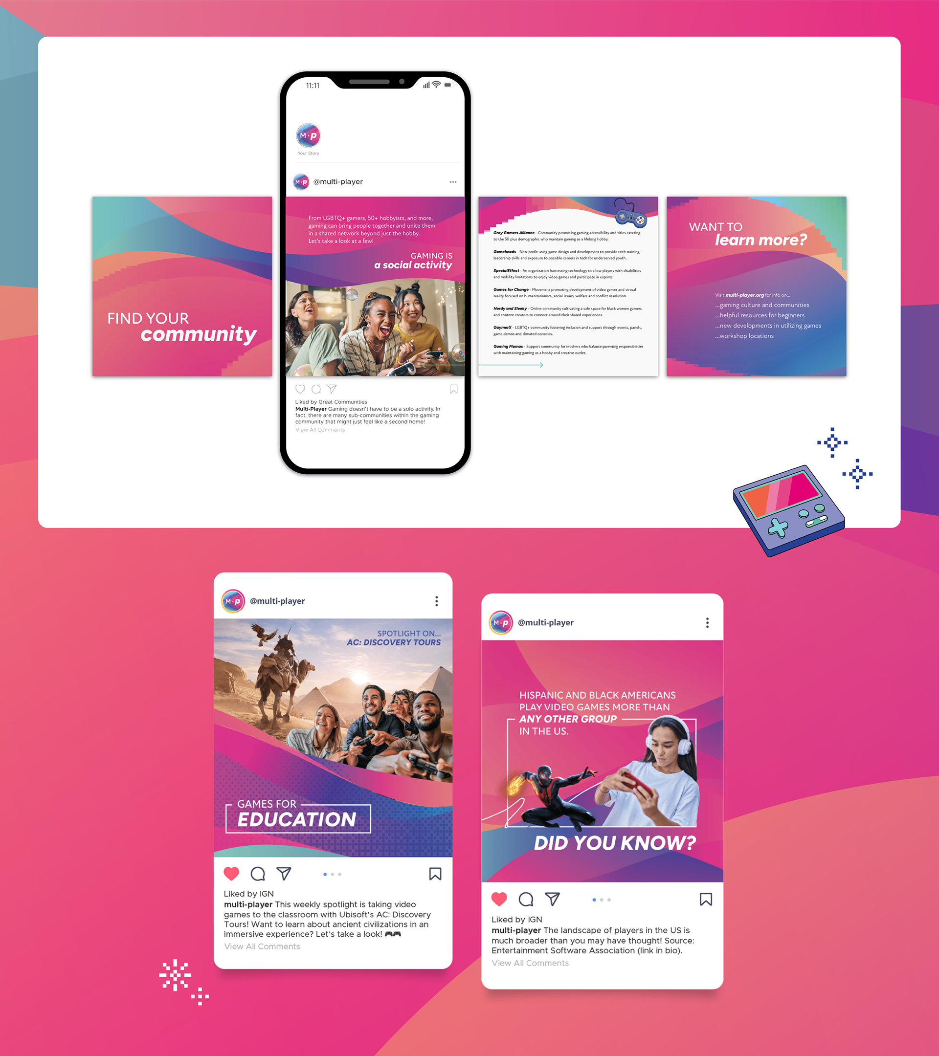
In an effort to introduce non-gamers to the world of gaming while fostering understanding and enthusiasm for the medium, a social media campaign acts as a starting point in bringing them into the fold with digestible bits of content and interaction within an open community.
Through posts that touch on fast facts, community resources, and spotlights of people and games in various contexts, the campaign is an access point that can then direct non-gamers to the Multi-Player website or workshops for more info.
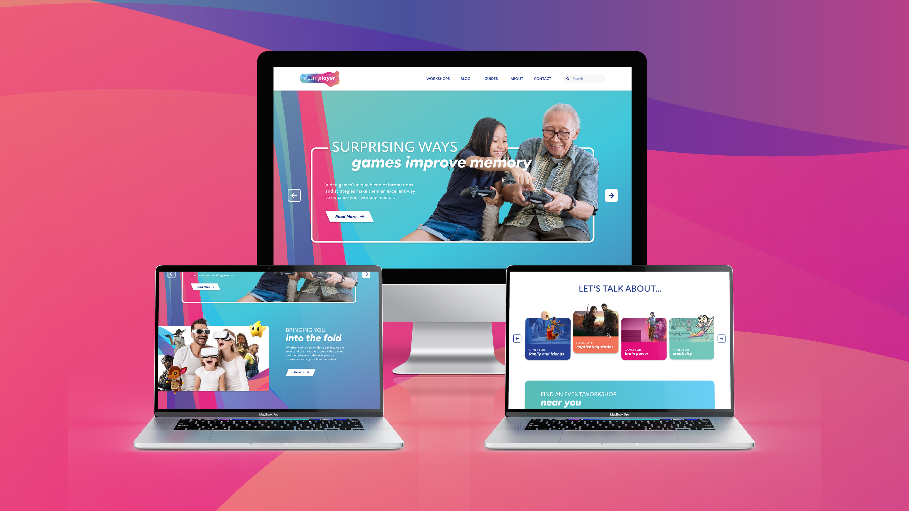
The website creates a place that non-gamers can go to for information that is more approachable through its language and layout. While some game-related sites do provide resources about gaming, it can often be too geared toward players that are already familiar with the medium, or else otherwise make assumptions about the people accessing the info.

Full Process Book